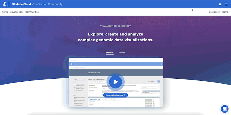
Visualization Community
Explore, create, and analyze
genomic and epigenomic visualizations.
Contributing Organizations

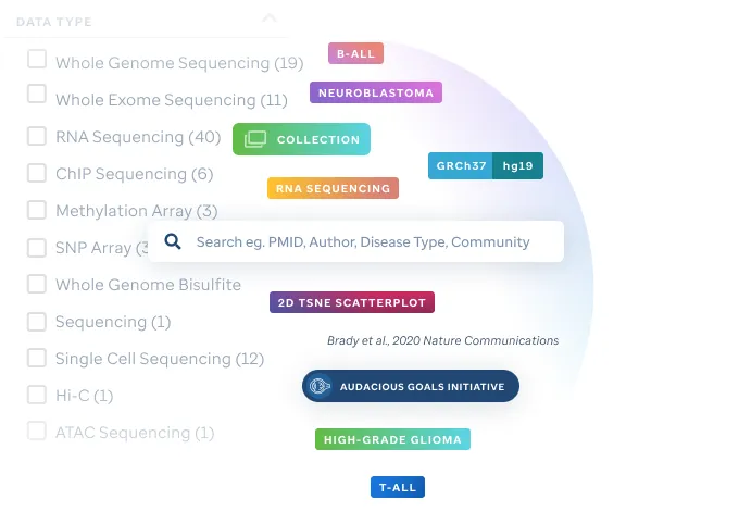
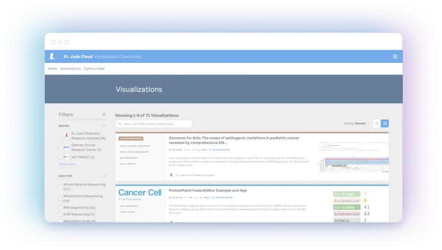
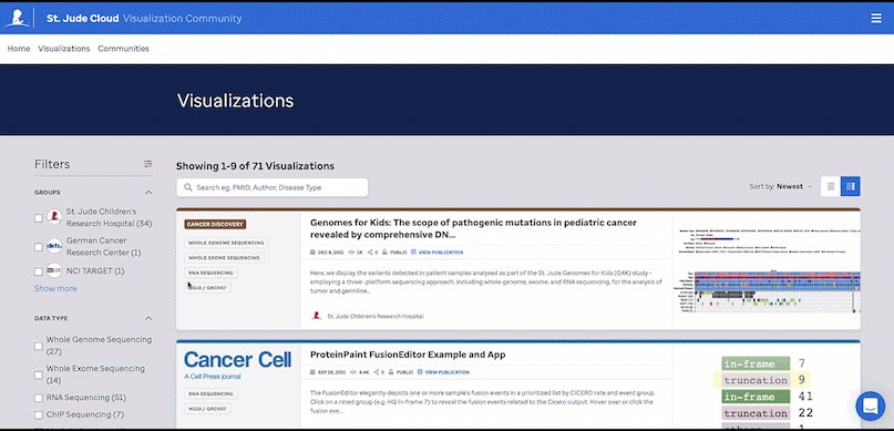
Search through our growing number of publication quality visualizations.
Easily identify genomic data visualizations associated with select pediatric cancers and other diseases via filtering on publication, project, institution or diagnosis.
Explore Visualizations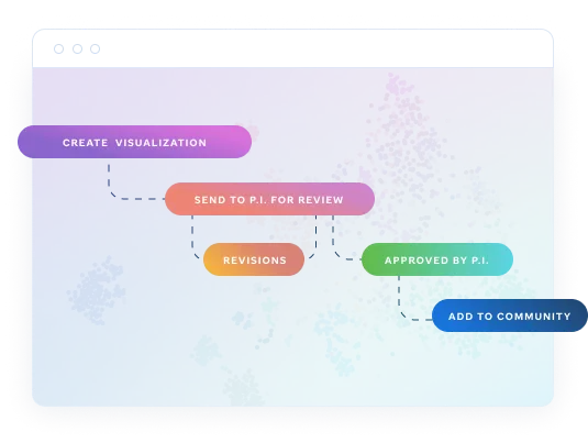
Create, review, and make your research public.
Any visualization you or your team create is private by default. This ensures privacy - P.I. approval is required to make visualizations publicly viewable once completed or published.
Build with the best.
Our state of the art tools render robust visualizations for quick analysis of simple or complex datasets.
GenomePaint
Interactive visualization platform for integrating whole-genome, whole-exome, transcriptome, and epigenomic data of tumor samples.
ProteinPaint
Visualize over 22 tracks to compare any set of variants in a gene in the context of protein domains and other information.

Allelic imbalance (aicheck)
Displays the allelic imbalance of the heterozygous SNP markers in a tumor genome as compared to this patient’s germline genome, as a way of indicating loss-of-heterozygosity.

Arc (hicstraw)
Used to display chromatin capture data by focusing on the frequency of links between distant genomic regions.

BAM
Visualizes the aligned reads and assists in understanding depth and quality of genomically mapped features on a nucleotide scale.

BigWig
This format shows the depths of reads in RNA seq, ChIP seq, or genomic sequence as aligned to a reference genome.

Expression Rank
Displays normalized expression in a genomic context such that regions that are distinctly highly expressed can be identified.

Hi-C (hicstraw)
The standard Hi-C visualization for chromatin conformation data highlighting observed linkages between distant genomic regions.

JSON BED (bedj)
This customizable bed format shows defined genomic regions identified by ChIP seq, mass spec or other means.

Lollipop plot
Used for displaying the frequency and type of mutation for a given gene on the protein structure in the context of functional domains.

MA+ Volcano plot
The MA plot contrasts the magnitude of expression (M) on the x axis against the amplitude (A) of change between two states. The volcano plot compares the amplitude of change (x-axis ) to the statistical reliability of that change (-log transformed p value, y-axis).

Mutation Landscape (heatmap)
Used for displaying the frequency of various mutations, CNVs and SVs in cancer relevant genes across a cohort of samples from one or many diagnoses.

Profile gene value (profilegenevalue)
Used to display gene. expression results from RNA seq across a cohort of samples.

RNA splice junction (junction)
This visualization displays the number of mapped junction reads precisely along with a gene model and will include alternative splicing and isoforms if available.

Splice Junction Cohort (mdsjuction)
This visualization displays the number and color codes the type of mapped junction reads precisely along with a gene model for multiple samples including canonical and non-canonical splice forms.

Stranded BigWig
RNA-seq coverage data as a pair of bigWig tracks, with forward strand on top and reverse strand on bottom.

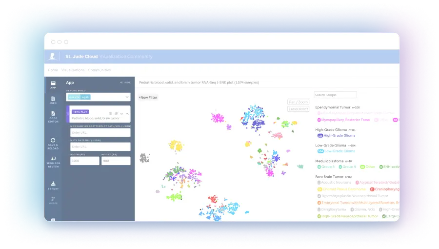
tSNE plot (Scatterplot)
tSNE plots are a display that converts high dimensional data to an interpretable proximity plot such that similarity may be assessed across RNA-seq profiles.

UMAP (single cell)
A data driven dimensional reduction method used to display single cell RNA seq data from a large number of cells.

VCF
This track localizes the variant data on reference genomes and can render frequency data for cohorts.

GenomePaint
GenomePaint is track-based visualization app that enables the ready comparison of genomic localized data from multiple methods including RNA seq, ChIP seq, HiC, SNV, SV, CNV, and methylation data.

Data Table Facet
Used to track and compare varied genomic features from complementary data types such as ChIP seq to reference genome features.
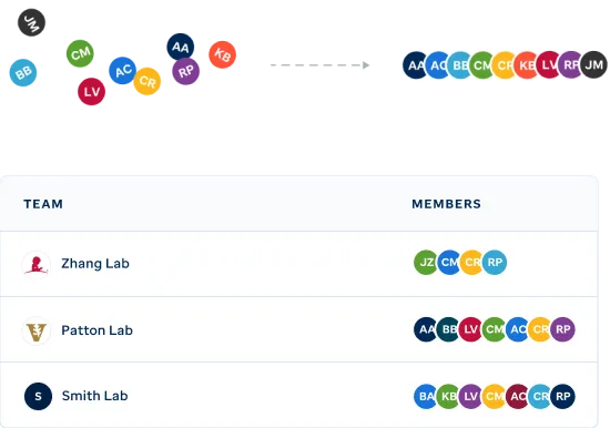
Organize your team's visualizations.
Easily identify genomic data visualizations associated with select pediatric cancers and other diseases via filtering on publication, project, institution or diagnosis.
View your teamsFrom private research to published interactive figures.
Increase the profile of your published visualizations and accessibility of your figures.
Public
Once reviewed by a P.I. or Team lead, a visualization can be made publicly accessible.
Published
Once your research has been published, add your PMID to your visualization to link with the associated publication.
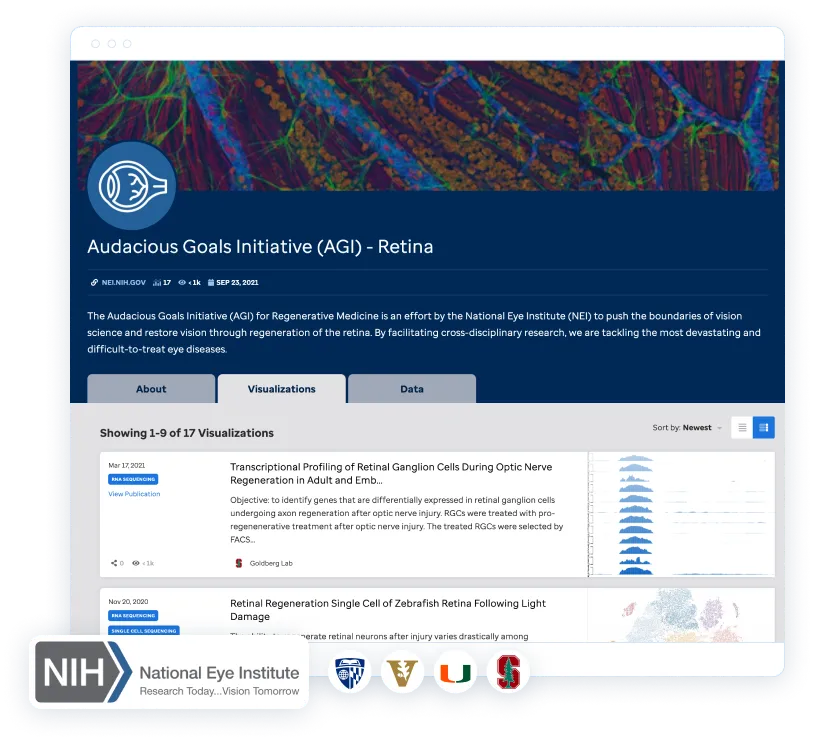
Collections
Organize multiple visualizations into a collection associated with your research.
The expression landscape of 588 RNA-Seq brain tumor samples - of which 459 are fresh frozen and 129 are FFPE samples. These are displayed via a t-SNE plot generated using the St. Jude Cloud RNA-Seq Expression Classification analysis workflow. Diagnosis subtype...
St. Jude Children's Research Hospital

Gene expression profiling of 1,988 B-cell acute lymphoblastic leukemia (B-ALL) cases shown in a two-dimensional tSNE plot (representative of Fig. 1a of Gu et al. 2019) employing the top 1,000 most variable genes. B-ALL subtypes are highlighted in different col...
St. Jude Children's Research Hospital
Selected visualizations related to improving quality of life for pediatric cancer survivors.
St. Jude Children's Research Hospital
Unify teams and labs together in one location.
Easily showcase your work and evolve the community of research.
View Communities
Genomic and proteomic data and analysis resources for the global research community.

Sequencing Data and Analysis
Access and analyze the world’s most comprehensive repositories of pediatric cancer-related genomics data and analysis tools.

Pediatric Cancer Knowledge base
Browse the pediatric cancer variant knowledge base, curated by researchers at St. Jude including pathogenicity classification and variant recurrence.

Interactive Figures
Create and share figures using St. Jude's unique genomic visualization tools such as ProteinPaint and GenomePaint.

Need more help?
Access our help guides whether it be on how to cite us, who to contact for support, or to find our curated examples with sample data to start generating your own visualizations.
Visit the Docs